With the help of Stoney Nakoda Nation members, students at Manachaban School will now don a new, more representative logo replacing the original – which was dubbed offensive.
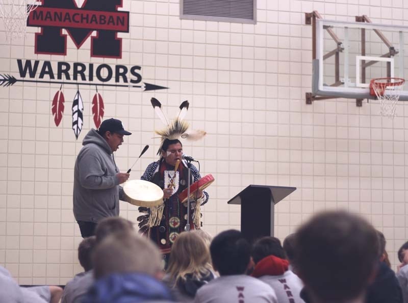
During a school assembly on Jan. 11, Stoney elder Sykes Powderface along with several dancers helped officially unveil the new logo with a traditional ceremony.
“When we looked at the original one it was … more of a confrontational image to us,” Powderface said of the old image depicting a stereotypical aboriginal warrior wearing a headdress.
The redesign was initiated a year ago by the school’s former principal, Thomas Elbel (now principal of Fireside School), with the help of one of the school’s art classes and Powderface.
One of the first tasks was to decipher the meaning of Manachaban. Powderface said it isn’t a known word in the Stoney language.
They concluded “Manachaban” was a name for the hill where the Treaty 7 original inhabitants came to craft their bows and arrows from the trees.
The new logo – a spear with three feathers hanging below – is a reflection of its history and symbolizes Cochrane’s indigenous neighbours.
“Culturally, the spears are protection or self-defense or hunting and so on,” explained Powderface. “Then of course three feathers represented our three bands in Morley – Bearspaw, Chiniki and Wesley.”
He added that the feathers also represent the powers of the eagle – a supreme being within Stoney spirituality.
“We honour the recognition of the eagle with the feathers,” he said.
The largest aspect of the design is a capital “M” above the spear and feathers, which Powderface said portrays and ties the relationship of the Manachaban School with the people of Morley, where many of the Stoney population resides.
The original team name – Warriors – will remain.
All the students at the assembly were wearing the school’s new T-shirt with the word printed vertically on the back. A group of students spoke about what each letter stood for when read as an acronym – Worker, Attitude, Respect, Resilient, Integrity, One hundred per cent, Reliable.
“And when we put all of those together, we’re Strong,” said current principal Anne Kromm, adding that part of the school’s year long theme is citizenship which ties in nicely with their “Warrior” title.
“We’ve been really working on ‘what does a warrior mean?’ and the citizen traits that come with it. So students are being identified on a weekly basis when they show examples of the warrior traits.”
“It feels amazing to be a warrior. It means that you’re working hard and always helping,” student emcee Navee Oosterveld said. “I’m on the student council. I intend to help with that and show all those eight things.”
The assembly included a smudge ceremony, an explanation from Powderface of the new logo design and a dance performance by Daryl Kootenay, Ariel Waskewitch with drums and singing by Shyles Smalleyes.
It’s going to bring new meaning to the school,” Waskewitch said. “It’s just a good feeling to see the name warriors out there. “
“If you need a mascot, call me,” she added after finishing her performance.
Kootenay said he appreciates being brought in to dance for a unique occasion.
“A lot of times we get brought in to town to dance and it’s related to Aboriginal Day or something along those lines. For a new logo it makes it extra special,” said Kootenay. “The fact that they’re reaching out to the neighbouring community, Morley, is really awesome too.”


